RAY WHITE
Refreshing a legacy
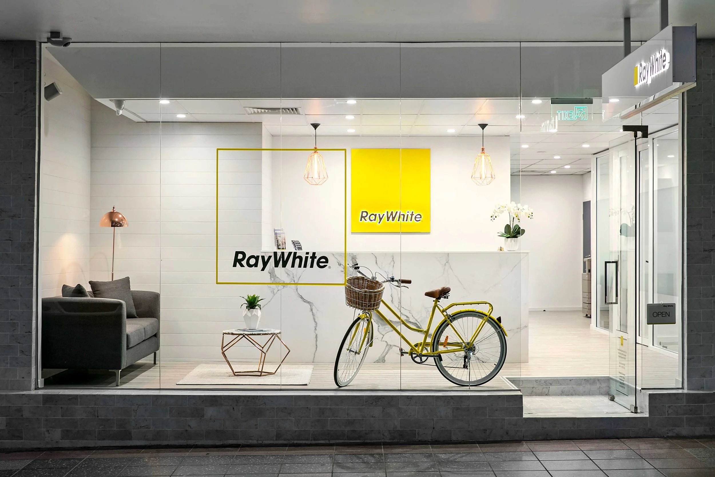
Ray White is one of Australia’s most recognised real estate brands, backed by over a century of history. But as the brand expanded, inconsistencies emerged—fragmented visuals, mismatched templates, and outdated design that no longer reflected its premium service.
With rising competition from boutique and tech-driven agencies, it was time to modernise. The challenge: refresh the brand while honouring its legacy, and build a system that scales seamlessly from signage to social.

A bold refresh with familiar roots
We refreshed the entire visual identity by refining the use of Ray White’s iconic yellow, introducing a modern and readable type system, and establishing consistent photography styles that feel natural and premium. Flyers, brochures, signage, and digital templates were redesigned with clean, modular layouts. We clarified logo usage rules, created a scalable brand toolkit, and ensured every touchpoint—from storefronts to social—feels cohesive, confident, and distinctly Ray White.
Brand Guidelines
Signage
Printed Collateral
Promotional
Digital Displays
Billboard/ Flag Poles